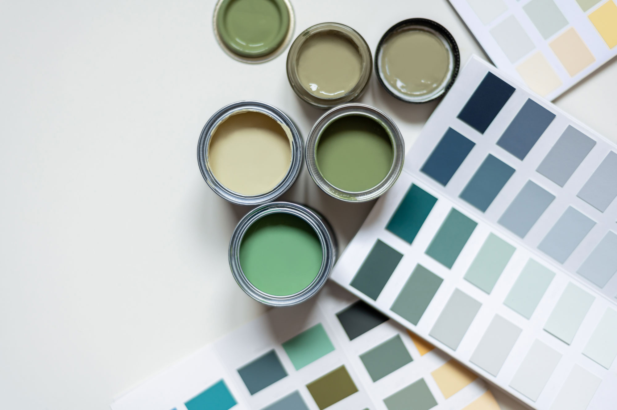
Paint Options
We colour match to the Farrow and Ball range and have hand selected 15 of our favourite shades for you to choose from as standard. Or, go totally bespoke and choose any other colour in the Farrow and Ball range for an additional fee of £50.
All surfaces are sanded smooth and primed before painted to ensure a smooth finish. Please note, you may still see and feel grain due to the natural characteristics of the wood underneath. All knots are treated with a knot blocking solution. This helps to prevent seepage and minimises discolouration from knots. Over time, especially with lighter colours, you may start to see or feel the outline of any natural knots in the wood underneath.
We send a small pot of touch up paint with every order. If you do happen to knock the paintwork or start to see knots showing up underneath, you can use this to keep it looking as good as new.

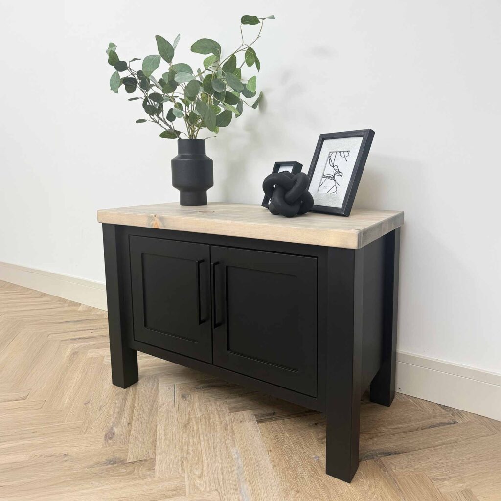
Pitch Black
As pure a black as you can get; strong and uncomplicated in all lights. Named after the dark sticky residue of coal tar often used in roofing, this daring, true black has an unsurpassable depth and almost velvet quality.

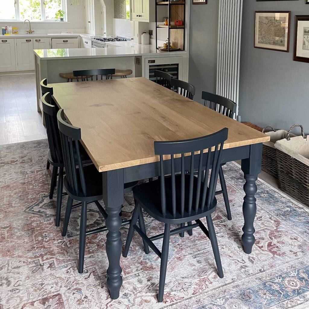
Railings
A soft black with blue undertones.
More blue than black, Railings is a softer alternative to black. The bluer undertones of this dark hue helps to create dramatic and enveloping interiors.

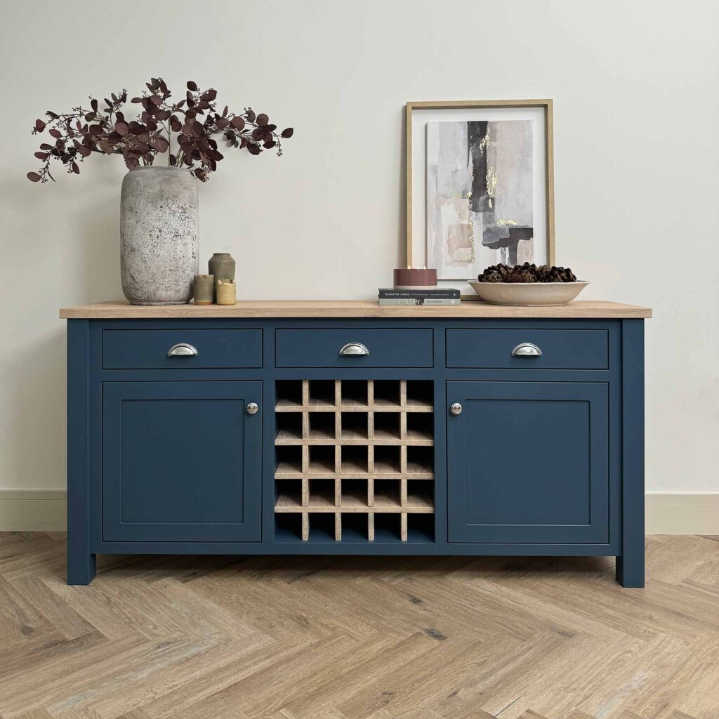
Stiffkey Blue
An inky blue with a particular deep navy hue. Although traditional in feel, Stiffkey Blue is often used to create a richly dramatic space with a more contemporary finish. When used in well lit areas of the home it will appear much bluer, working wonderfully when contrasted with Ammonite.

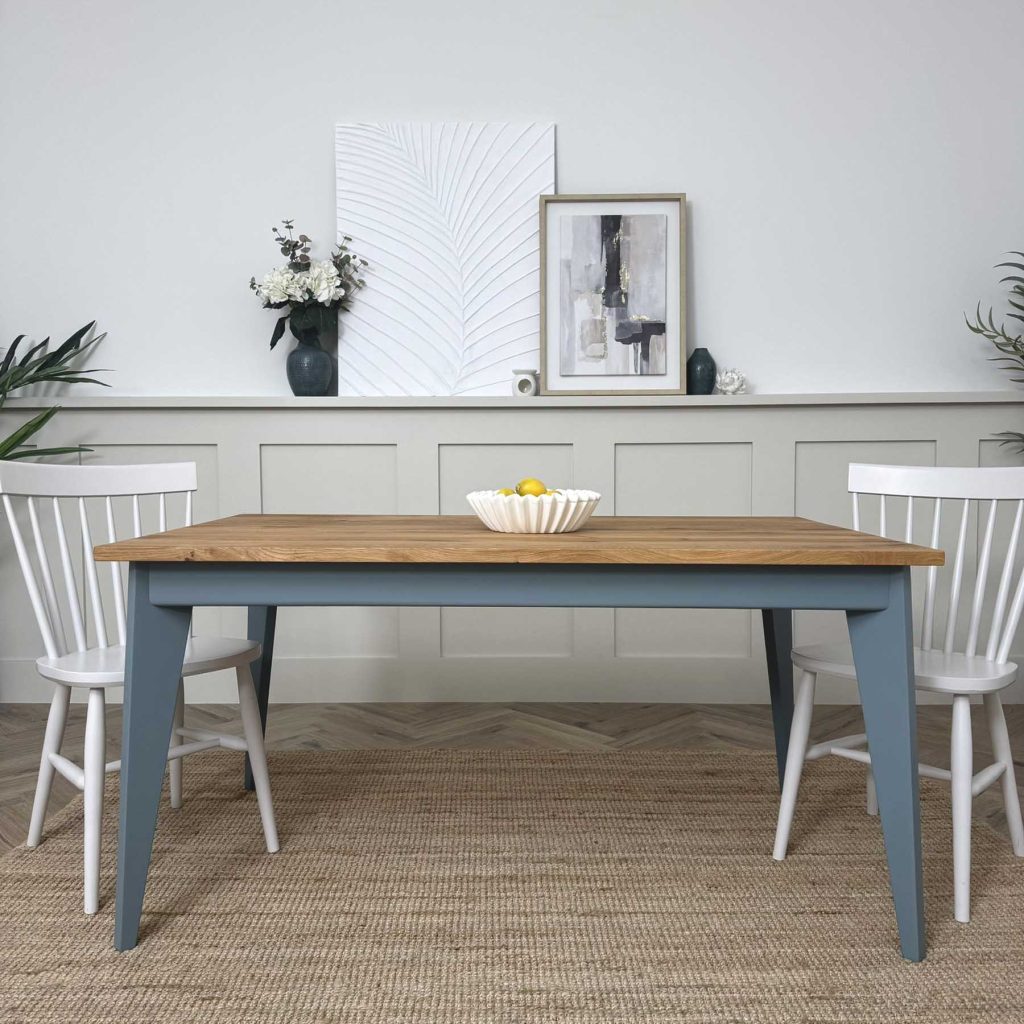
De Nimes
A down to earth and grounding blue. Quietly elegant, the exact shade is rooted in a regency palette but is inspired by the cloth of everyday workwear made in the French city Nîmes. Like denim, its blue hue is ultimately fashionable and yet always feels grounded.
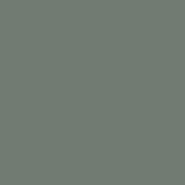
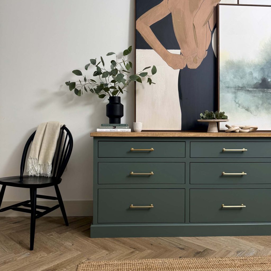
Green Smoke
A dark and smoky green blue, this colour was popular in interiors during the late 19th century. It has an irresistibly inviting deepness, while evoking calm and serenity.

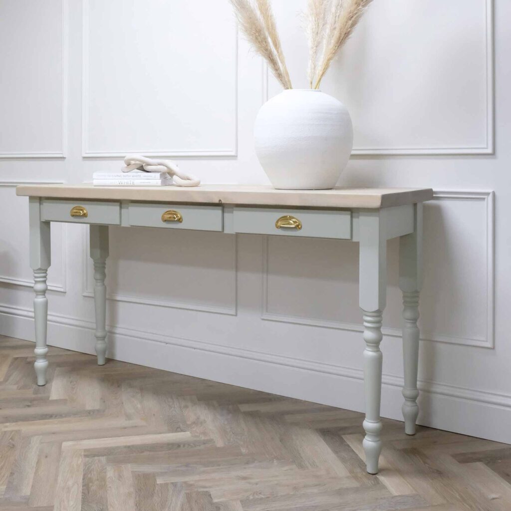
Mizzle
A soft grey green, named after West Country evening skies when there is a mix of both mist and drizzle. The addition of green pigment diminishes any cool blue tones.

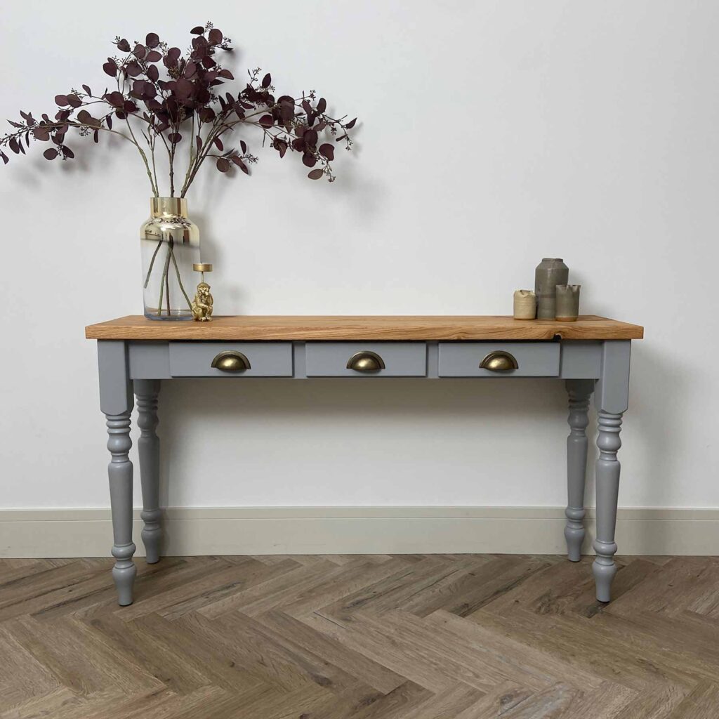
Manor House Grey
A cool architectural grey which retains its colour in all lights. Very popular in hard-edged contemporary homes that are conducive to minimal living and is often used alongside the more dramatic Railings.

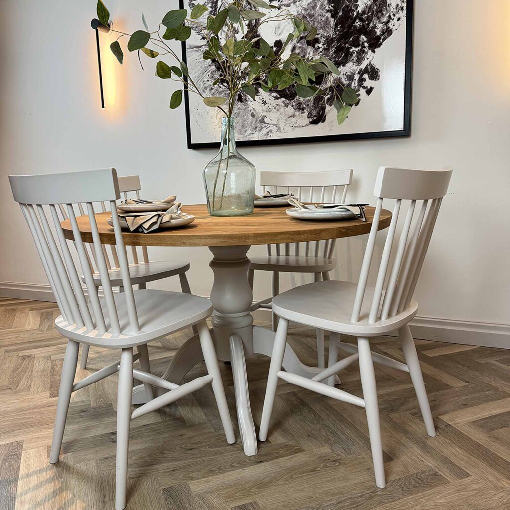
Cornforth White
An understated and extremely versatile grey. Neither too warm nor too cool, Cornforth White creates a hushed and calming retreat. Named in memory of John Cornforth, the revered architectural historian.

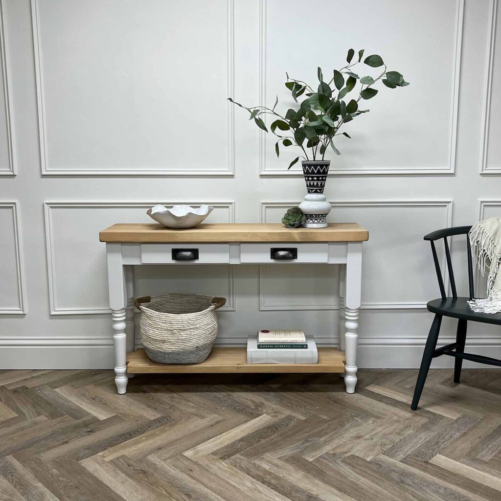
Ammonite
A naturally understated grey, named after the treasured fossils often found on the Dorset coast. It has a fantastically understated quality. Neither too warm nor too cool, its subtle grey tone creates a hushed and calming feel in homes both old and new. Try pairing with white tones to accent its light grey feel.

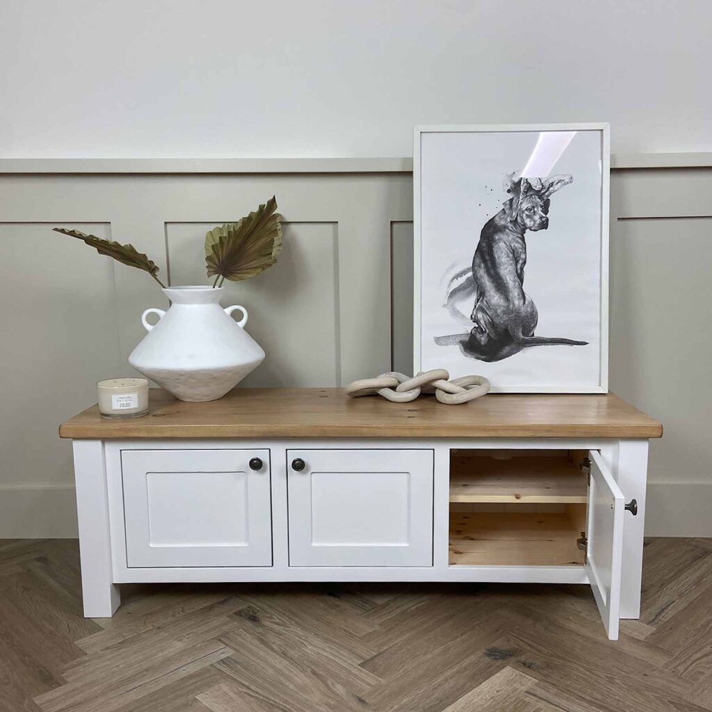
All White
A totally pure white. Unusually, it contains no other pigment except for white, creating the softest most sympathetic colour without the colder blue undertones of a brilliant white. For a clean and almost graphic finish, contrast with fresh, strong tones like Pitch Black.

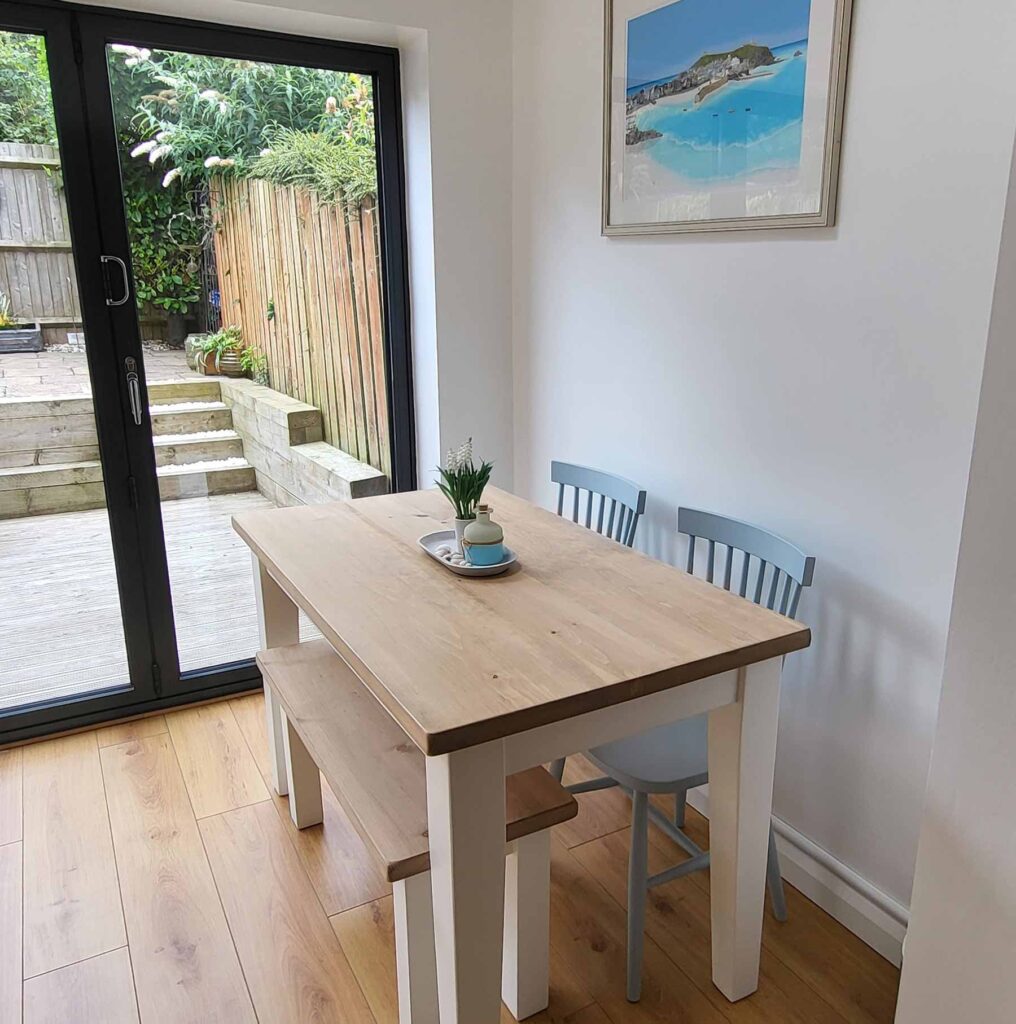
Wimborne White
Just off white, named after the market town of Wimborne in Dorset and home to Farrow & Ball. Only a shade away from a pure white, the addition of the smallest amount of warm yellow pigment creates a very versatile shade which is just a little softer than All White.

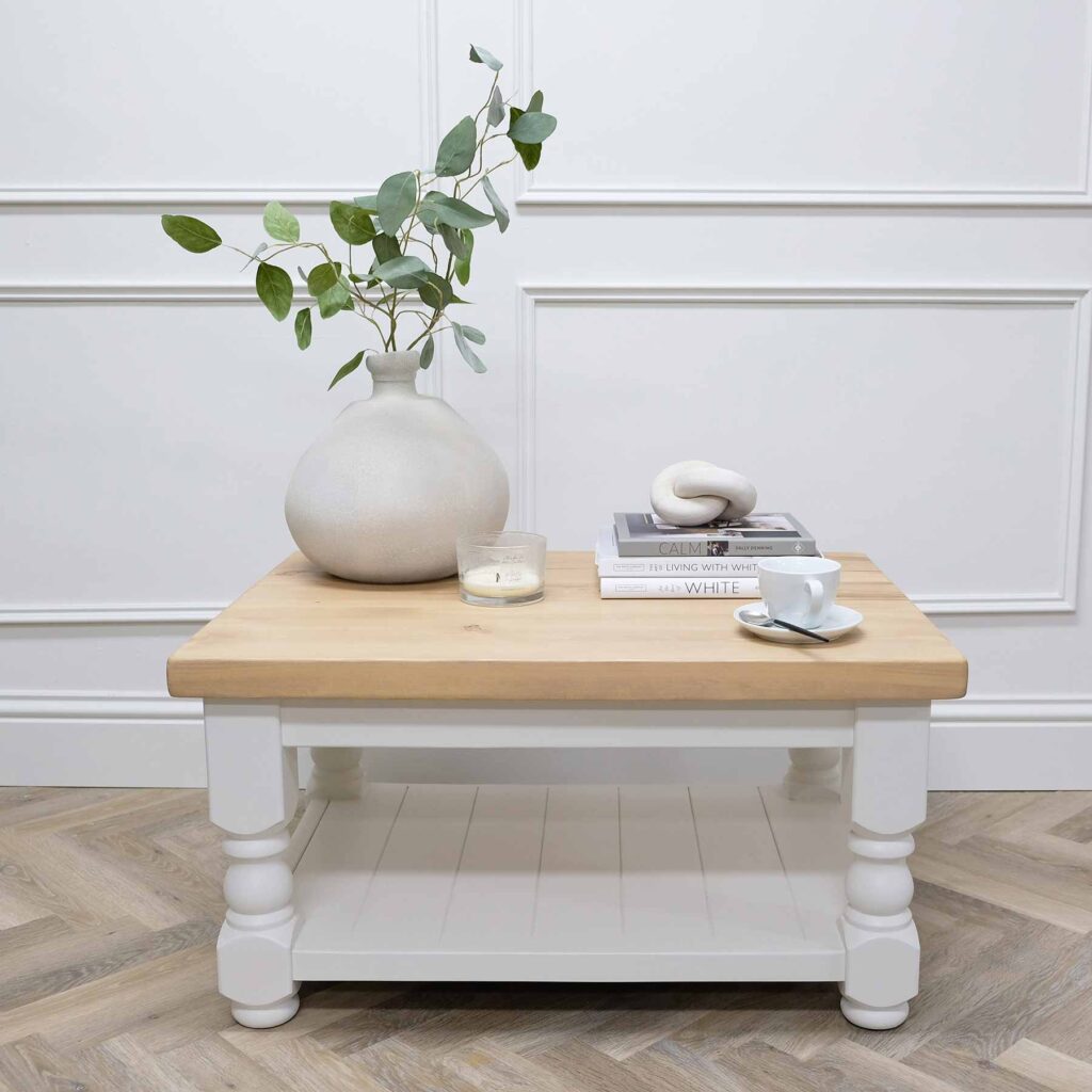
Strong White
A grey based white. Strong by name and strong by nature. The subtle urban feel of its light grey undertones add a contemporary twist to period homes, while staying in keeping with modern properties. Pair with All White in any combination for an effortlessly cohesive scheme.

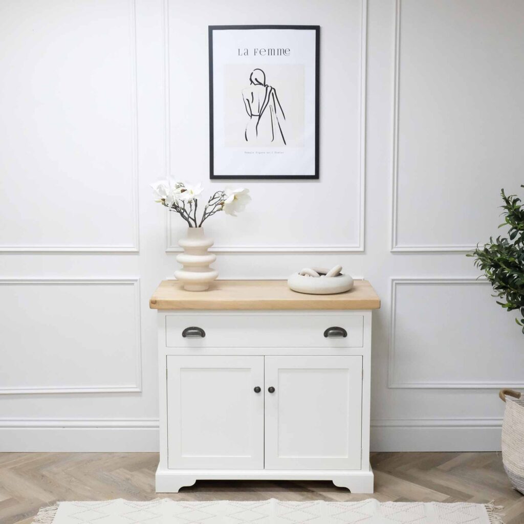
Pointing
A warm and delicate white. Fresh and uncomplicated and named after the colour of lime pointing used in traditional brickwork. Pointing has a warm undertone to it which always softens the feel of a room alongside strong, traditional colours.

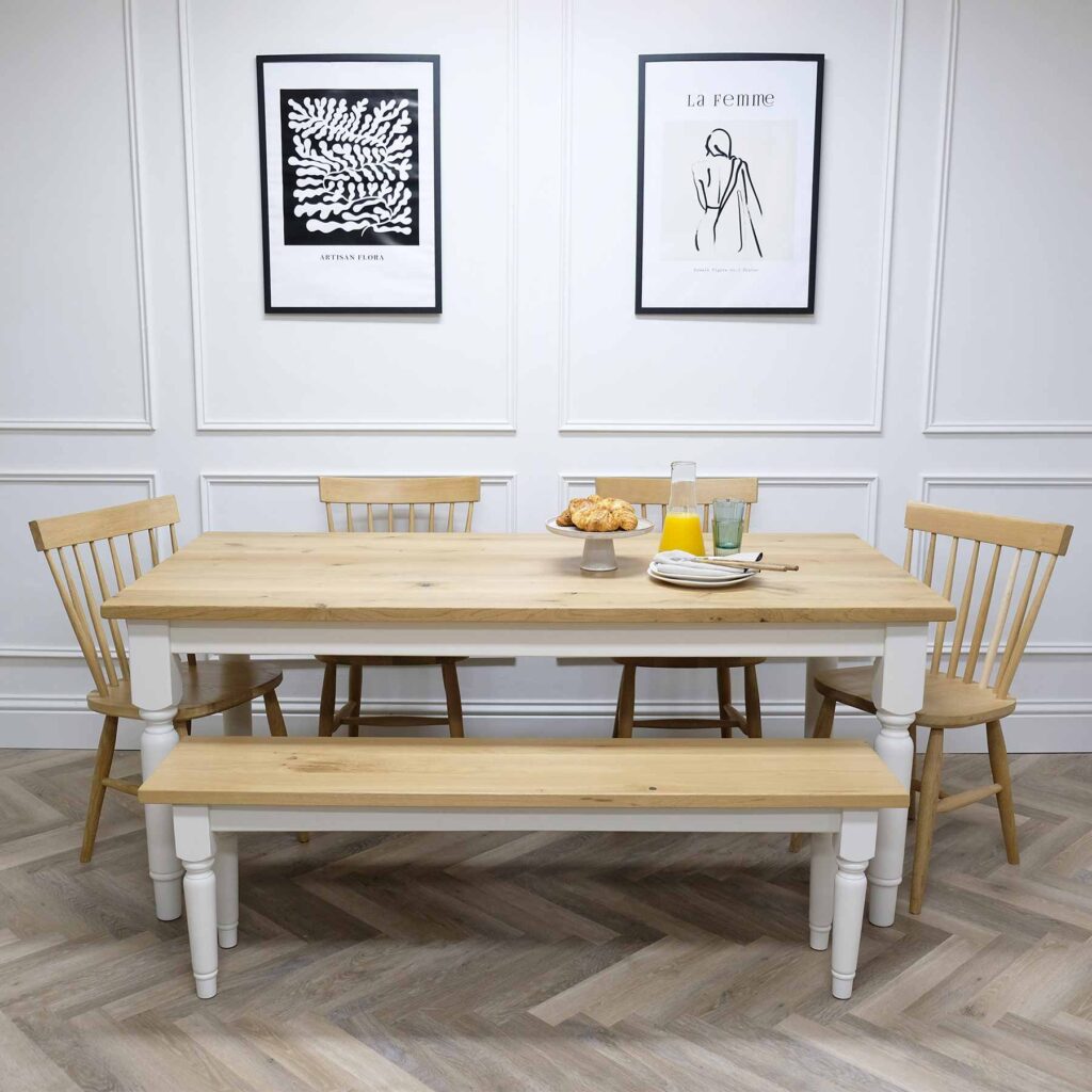
Slipper Satin
A popular, chalky off white, taking its name from the delicate colour of silk used in traditional ballet slippers. Without cool blue undertones, Slipper Satin often reads as a pale grey chalk which makes for a perfect neutral.

Lime White
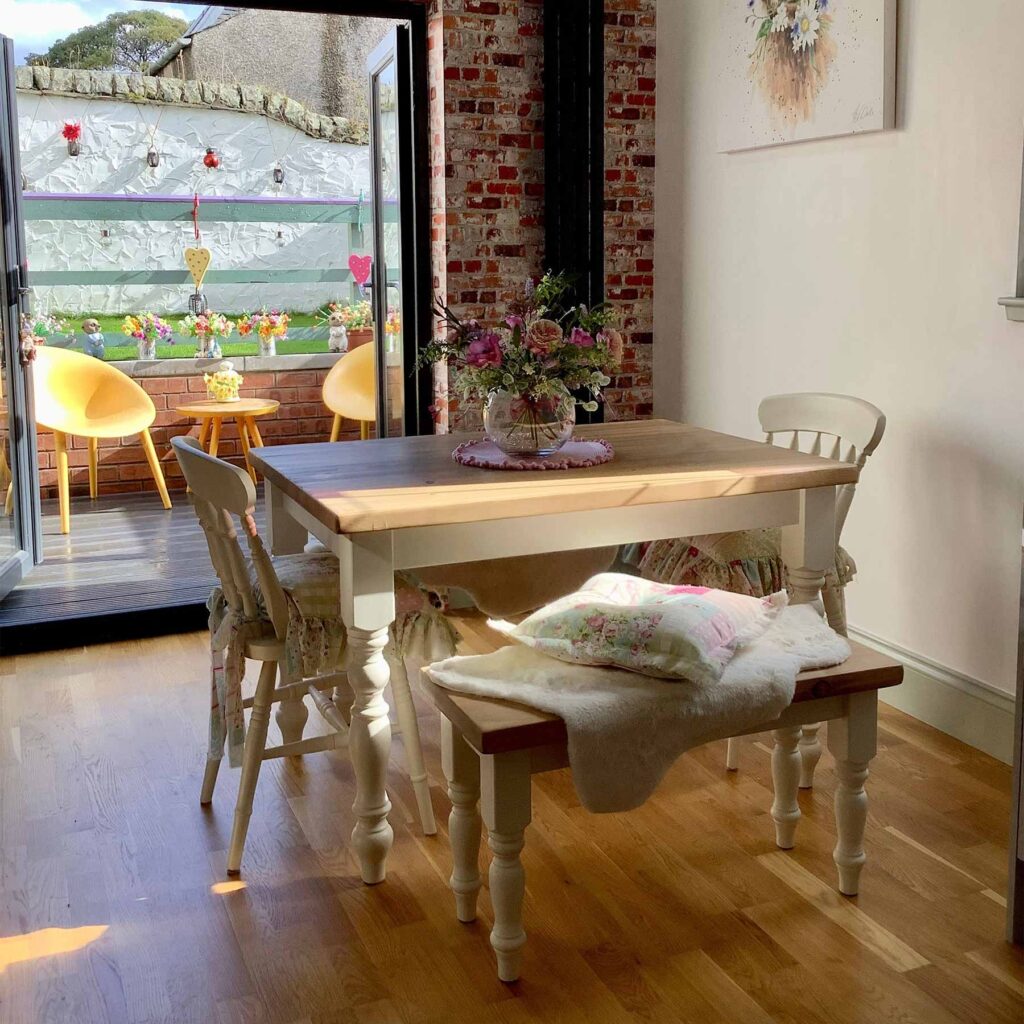
A timeless, chalky off white, named after the chalky pigments used in original distempers. Its soft tone is created by the addition of a small amount of green pigment. When combined with Slipper Satin it becomes both sophisticated and understated.
Bespoke paint options
If you have a bespoke colour in mind, we’d be happy to accommodate your request! Simply enter your desired colour in the free-type box on the product listing (ensuring you spell it correctly), including the brand of paint you want us to match to. As long as our paint supplier can match it*, we can do it!
Popular choices include Little Greene, Farrow & Ball, and Dulux. If we’re unable to achieve the colour match, we will always get back to you.
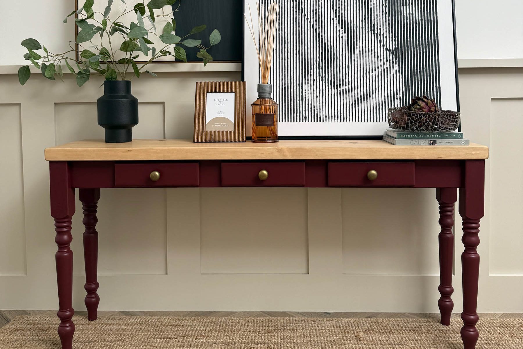
*Please keep in mind that paint batches can vary, so allow for a 10% tolerance in shades. The sheen level of an existing product can also affect the appearance of a colour. For a small fee of £50, we will colour match your chosen shade, ensuring your furniture perfectly complements your space.